We haven't had any graphs for awhile so here we go.
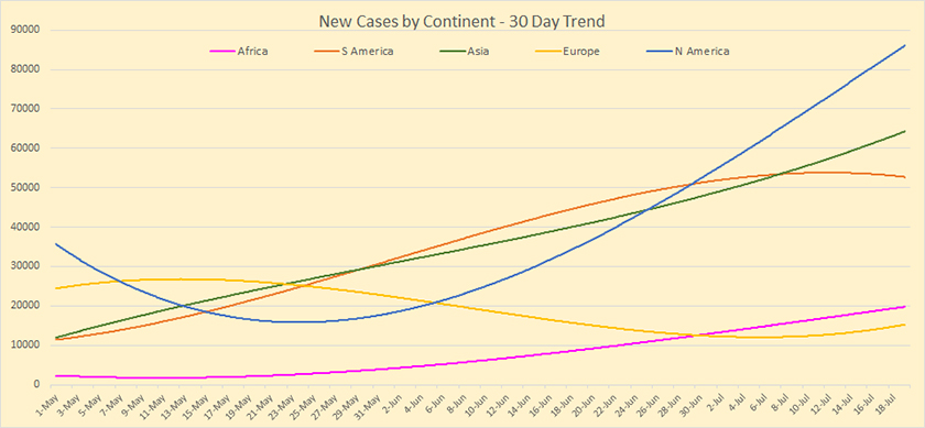
First, the 30 day new case trend among the continents which shows only South America starting to trend down while the rest are all heading upward; North America quite sharply.
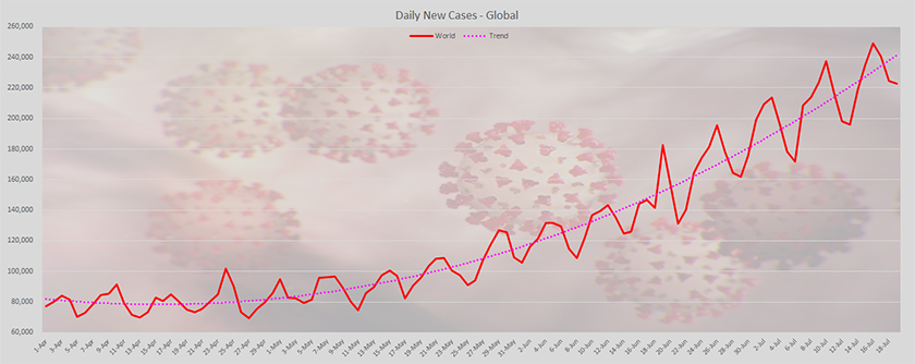
The trend for new cases globally is still on an upward trend but it is starting to ease the rate of climb a little:
The global trend for deaths had been improving since it peaked in mid-April but it started to climb again from mid June onward:

Next are the cases and deaths per 100k of adult population for some of the countries we have been watching:


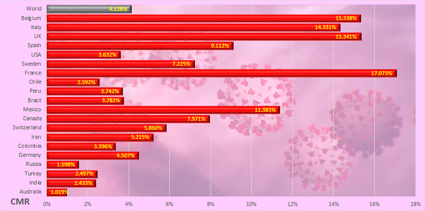
.. and the CMR for those same countries:
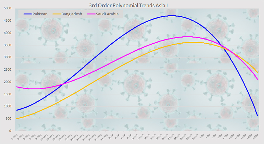
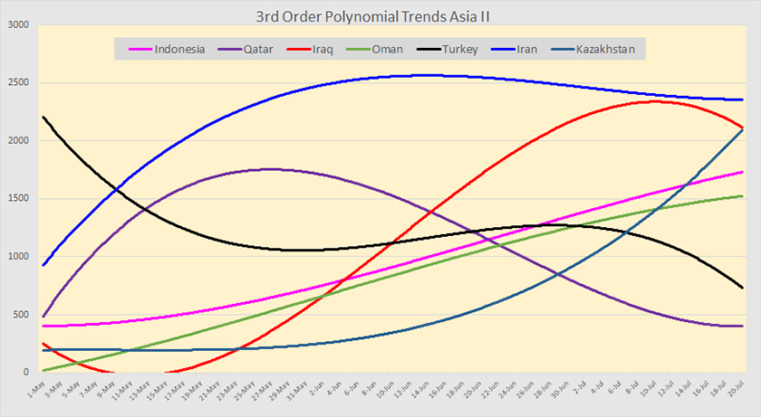
Drilling down on some selected Asian countries to look at the trends, these countries are divided into 3 groups based on scale.
This first group of three countries, those with the highest case numbers, are all trending downward with Pakistan dropping sharply:
The middle sized group of six is a bit of a mixed bag with Indonesia, Kazakhstan and Oman still trending upward; Iran relatively flat, while Turkey, Iraq (just) and Qatar are heading downward.
The largest group, those with the smaller case numbers, is also a mix of winners and losers. Kuwait, Singapore and the UAE are all trending upward while the remainder are all trending downward with Nepal showing the steepest rate of decline.
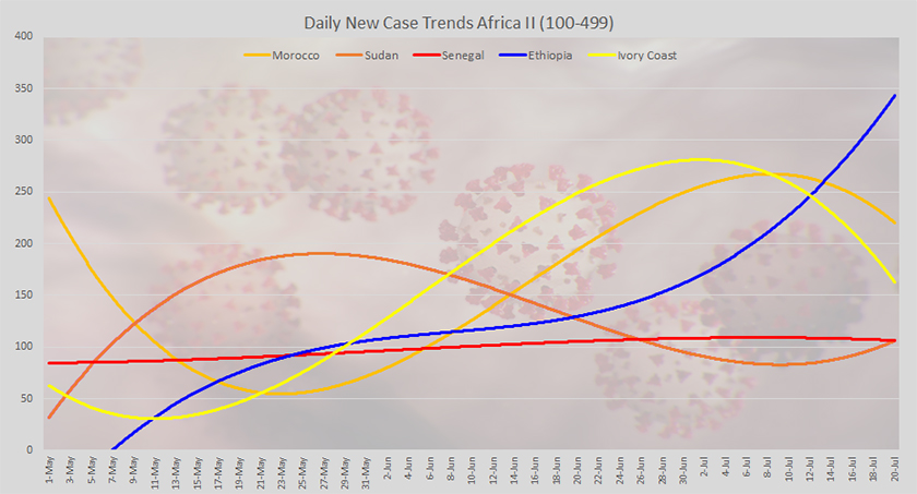
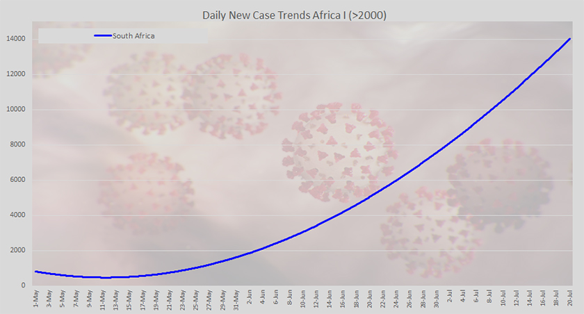
Likewise, Africa is now divided into three groups although this first one only contains South Africa which is still trending steeply upward:
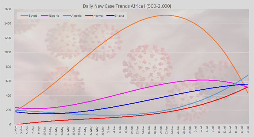
The 2nd graph covers the countries with intermediate case numbers where Egypt (sharply) and Nigeria are both on the downward curve while Algeria, Kenya and Ghana are all trending upward - the latter only slightly.
The third graph looks at those with low case numbers where Morocco and the Ivory Coast are trending downward, Ethiopia and the Sudan are trending upward (the latter only just) and Senegal is fairly flat.